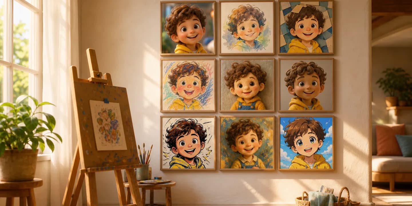
When you make a book on KindFable, the second decision you make — right after whose book it is — is what the whole thing should look like. Nine art styles are on the table, and every one of them is a real, committed look: the cover, all the spreads, and your child's character are painted in that style from the first page to the last.
Below is each style as it actually renders, using the same test hero in the same sunny meadow so you can compare like with like — plus the developmental psychology behind why each look works on a young child, with the real research behind it. Then: how the engine keeps your child recognizable in all nine, what age should shape your pick, and a one-minute guide to choosing.
Why the art style isn't just decoration#
It's tempting to treat "which cartoon look do I want" as pure taste, the same decision as picking a font. Developmental psychology says it's a little more interesting than that — because a young child's visual system is not a smaller version of an adult's. It has its own preferences, its own timeline, and its own rules for what counts as "a picture of me."
Start with the basics of what infants even look at. In a landmark series of experiments, Robert Fantz showed that infants as young as a few months old consistently look longer at patterned, high-contrast images than at plain or blank ones — the earliest evidence that a baby's eye is drawn to visual complexity and structure, not indifferent to it (Fantz, 1961). That's the first reason nine distinct, committed styles exist rather than one "default" look: from the very start, how a page is rendered is something a child's visual system actively notices, long before they understand the story on it.
The second piece is about when a picture becomes a picture of them. Children don't arrive already understanding that a two-dimensional image can stand for a real person, including themselves — that's a skill called symbolic understanding, and Judy DeLoache's research found it develops gradually across the first years of life, with very young children sometimes treating a picture as if it were the real object it depicts rather than a symbol of it (DeLoache, 2004). Self-recognition follows its own separate timeline on top of that: in Beulah Amsterdam's classic "rouge test" study, most children did not reliably recognize their own mirror image until somewhere between 18 and 24 months (Amsterdam, 1972) — the same milestone that governs when a child recognizes a painted likeness as themselves, which is why the "what age" section further down matters as much as which style you pick.
None of the nine styles below is "backed by science" in the sense of a randomized trial testing KindFable specifically — nobody has run that study yet, on us or on any picture-book publisher. What follows is more honest and more useful: the real, separately-published developmental research each style's core visual idea connects to, style by style, so you can see the reasoning instead of taking "kids like this" on faith.
It's also worth saying plainly why there are nine options instead of one research-optimal look: children aren't a single data point, and neither is taste. A toddler's pull toward high-contrast pattern (Fantz, 1961) doesn't mean every two-year-old wants the boldest style on the shelf — some gravitate to Comic Pop's punch, others to the quiet of Watercolor, and a parent's own sense of what feels like "our family's book" is a real input too, not a variable to optimize away. Nine committed styles exist because the honest answer to "which style is best for a child" is "the one that fits this particular story, this particular kid, and this particular shelf" — not a single universal winner.
One more honest note before the gallery: the meadow behind our test hero below is a fixed comparison scene, chosen so you can judge the nine renderings side by side. Your own book doesn't reuse that meadow — the backdrop, the weather, and the small details around your child are built from the story you actually write, not a stock setting recycled from book to book.
The nine styles#
3D Cartoon#
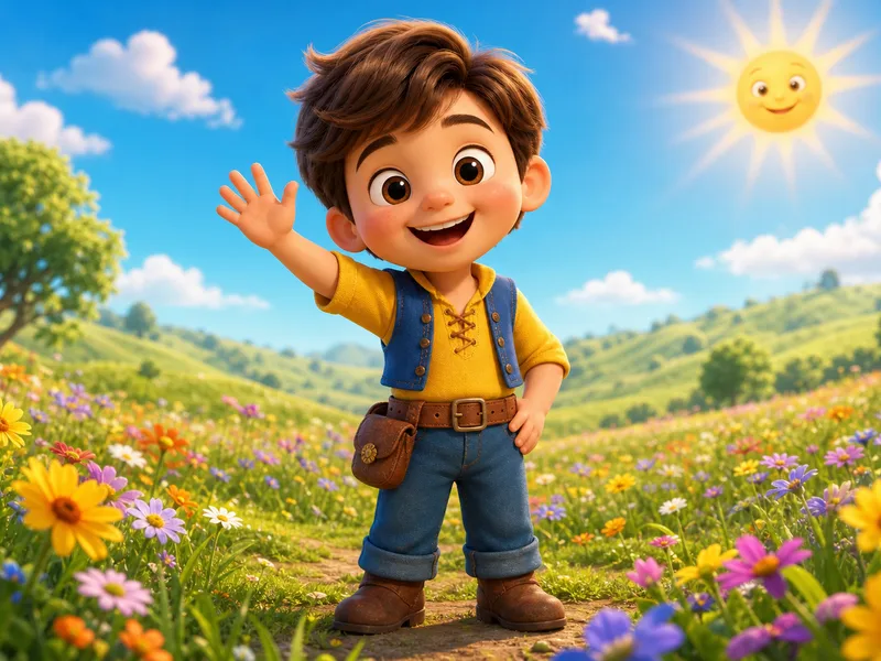
The look of a modern animated family film: soft rounded forms, big expressive eyes, cinematic lighting, rich color. This is the crowd-pleaser — kids recognize the language instantly from the movies they love, and it flatters faces beautifully. A safe first pick for almost any story, and the style most families choose.
The psychology: the rounded face, high forehead, and oversized eyes that define this style aren't a Pixar-specific invention — they trace back to what ethologist Konrad Lorenz called Kindchenschema, the "baby schema" of infantile features that reliably trigger warmth and caretaking instincts in adults and children alike. A 2009 study measuring how adults rated infant faces with these features exaggerated found cuteness ratings and caregiving motivation both rose in step with how strongly the features were present (Glocker et al., 2009). 3D Cartoon leans on exactly that visual grammar, which is part of why it reads as instantly warm to almost every age.
Best for: birthday and adventure stories, a first personalized book for a family unsure which style to try, and any child who already has a favorite animated film. Look for the soft rim-light around the hair and the slightly oversized eyes — the two details doing most of the warmth.
Classic Storybook#
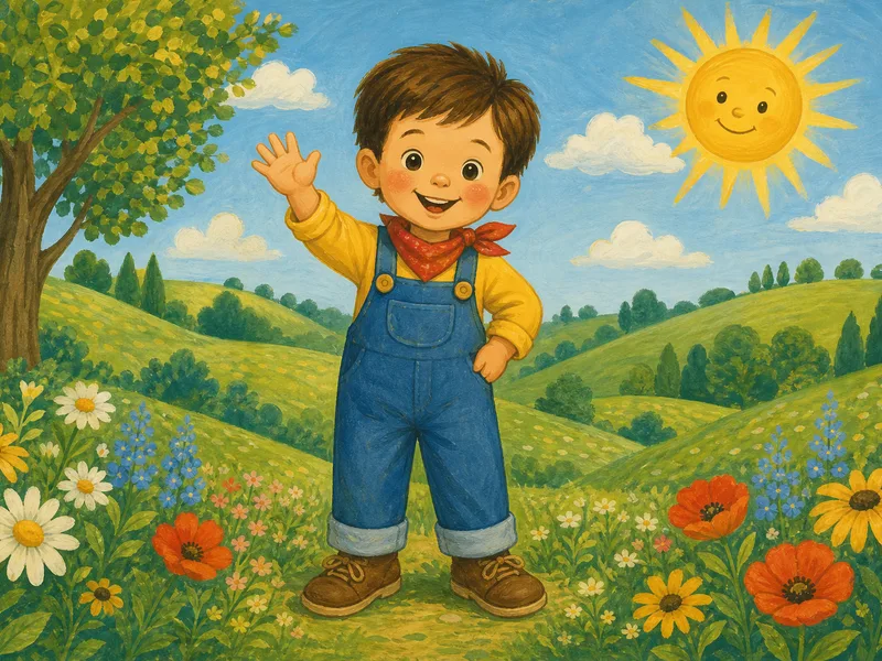
Soft, timeless, hand-painted — the warm gouache tradition of the picture books your own parents read to you. Friendly shapes, gentle color, decorative painted backgrounds. Choose it for a book that should feel like an heirloom the day it arrives, or as a gift from grandparents who grew up on exactly these pages. To see whole finished books in this style, read the case study of a real Classic Storybook book — built from three sentences about a first library card — and a personalized fairy tale book grown from a single sentence about a rainbow waterfall, with its song.
The psychology: this is the look of shared reading itself, and shared reading carries its own well-studied developmental weight. A review synthesizing decades of research on picture-book reading with young children found that the ritual of the reading session — familiar illustrations, a caregiver's lap, the same book returned to again and again — is itself part of what drives language and attachment outcomes, not just the words on the page (Fletcher & Reese, 2005). A style built to look like the picture books already on your shelf borrows that familiarity on sight, which is exactly why it reads as an heirloom rather than a novelty. It's also a natural pick for a book made for a grandparent to give, since the visual language matches what they grew up reading aloud themselves.
Best for: christenings, first birthdays, and any book meant to be kept — not just read once and shelved. Look for the visible brushwork in the backgrounds and the warm, slightly muted palette; nothing here is meant to look screen-lit.
Watercolor#
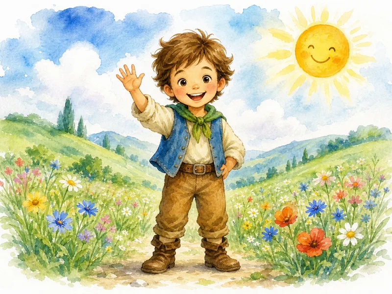
Dreamy washes that bloom and dissolve, visible paper grain, light that comes from the unpainted white of the page. The gentlest style of the nine — perfect for bedtime stories, quiet moments, and any book meant to slow a child down rather than wind them up.
The psychology: bedtime books do a specific job, and the research on bedtime routines backs up why a calmer visual register earns its place there. A major review of the evidence on nightly routines in young children found consistent, predictable bedtime rituals were linked not only to better sleep but to broader gains in language development, emotional regulation, and the parent-child bond — with sameness and calm doing real developmental work, not just settling a child down (Mindell & Williamson, 2018). Watercolor's soft edges and low visual noise are built for exactly that moment: a page that asks a child to slow their eyes down instead of scanning for the next bright thing.
Best for: the last book of the night, quiet-moment stories about naps, stars, or the sea, and a gift for a new baby. Look for the unpainted white paper doing the work of light — nothing is fully outlined, which is what gives it that dissolved, breathing quality.
Anime#
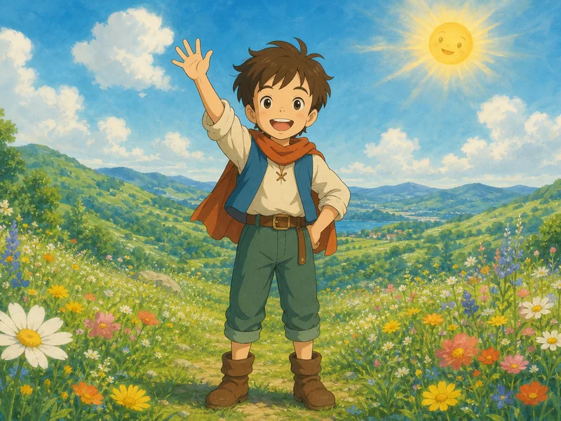
Bright, expressive characters against lush painted worlds, in the warm cinematic tradition of the great Japanese feature films. Wonderful for adventure stories with big skies and big feelings, and a frequent request from kids aged six and up who already know exactly what anime is.
The psychology: anime's signature move — exaggerating eyes, expressions, and key facial features well past photographic accuracy — has a real cognitive payoff. Classic face-recognition research found that people identify caricatured faces faster than accurate line drawings of the same face, because a caricature exaggerates the very features that make a face distinctive in memory in the first place (Rhodes, Brennan & Carey, 1987). A style built around big, legible, emotionally readable eyes isn't just stylish — exaggeration of this kind is measurably easier for a young viewer's brain to lock onto and remember.
Best for: big-sky adventures, stories with a clear brave-moment arc, and kids six and up who already have opinions about animation. Look for the painterly, cinematic backgrounds behind the character — the world gets as much treatment as the hero does.
Claymation#
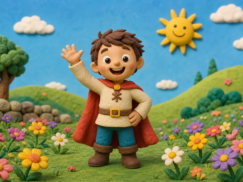
Everything looks hand-sculpted from clay and photographed on a miniature set — fingerprint textures, real little shadows, warm studio light. Playful and tactile; kids want to reach into the page. It gives funny stories an extra comic warmth.
The psychology: "kids want to reach into the page" isn't just a figure of speech for this style — touch is one of the primary channels young children use to understand the world around them, and researchers studying infant and toddler motor development have found that hands-on, haptic exploration is closely tied to how children build perceptual understanding of objects and their properties in the first place (Bushnell & Boudreau, 1993). A style engineered to look touchable — visible fingerprints, real shadows on real-looking clay — speaks directly to a sense that's already doing a lot of a young child's learning.
Best for: funny, physical stories — a wobbly first bike ride, a puppy chase, anything with a pratfall in it. Look for the visible thumbprints in the clay and the real miniature-set shadows, the two cues that sell the stop-motion illusion.
Comic Pop#
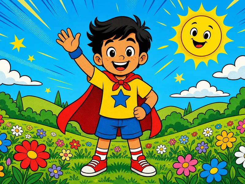
Bold ink outlines, punchy flat color, halftone dots, starburst energy — a kid-friendly comic book, not a dark one. The natural home for superhero plots, dinosaur chases, and any child who narrates life in sound effects.
The psychology: the punch in "punchy flat color" is doing real work. Infant vision research measuring which hues babies actually look at longest found young children's color preferences are systematically tied to how saturated and distinct a color is from its background — not a randomly acquired taste, but a measurable, biologically-grounded pattern present from just a few months old (Franklin, Bevis, Ling & Hurlbert, 2010). Comic Pop's flat, high-saturation palette and thick black outlines are close to the most visually legible combination a young child's eyes can land on, which is a large part of why the style reads as "loud" in the best sense.
Best for: superhero and dinosaur stories, sports triumphs, and any kid who narrates their own day in sound effects. Look for the halftone dot shading and the starburst motion lines — both borrowed straight from real comic printing.
Paper Collage#
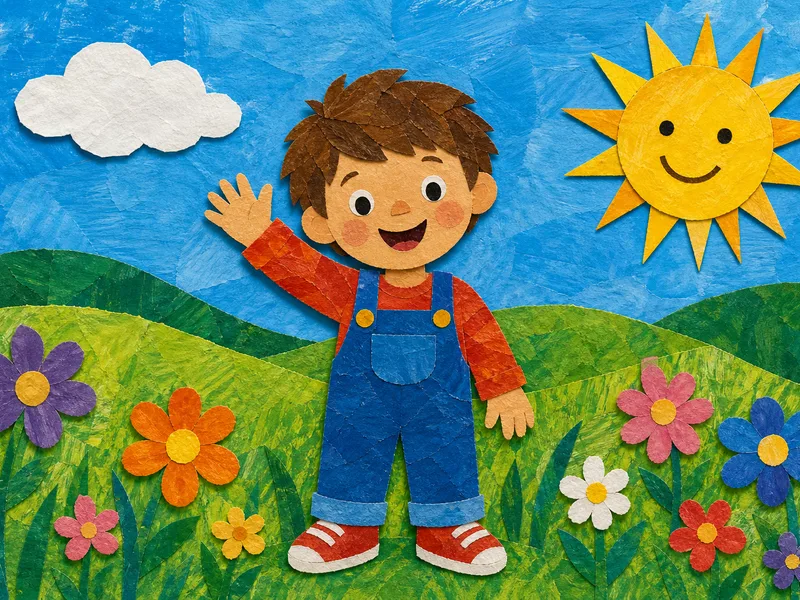
Layered cut-paper shapes with painted texture and torn edges, in the tradition of the most beloved collage picture books. Graphic, crafty, and instantly cozy — it looks like something a very talented family made together at the kitchen table.
The psychology: that "made at the kitchen table" feeling is more than an accident of the style. Classic developmental research on how children's own artwork evolves describes a progression from early scribbles toward flattened, boldly-outlined shapes with strong edges — visually close cousins of a cut-paper collage — as children move through the preschool years (Lowenfeld & Brittain, described in a 2025 empirical review of the developmental stages). Paper Collage's flat, strong-edged shapes echo the same visual logic a young child's own hand naturally produces, which is exactly why it reads as familiar rather than sophisticated.
Best for: craft-loving families, everyday-life stories, and a book that should feel handmade rather than polished. Look for the torn paper edges and the visible layering — each shape sits slightly on top of the one behind it, like a real collage.
Crayon Doodle#
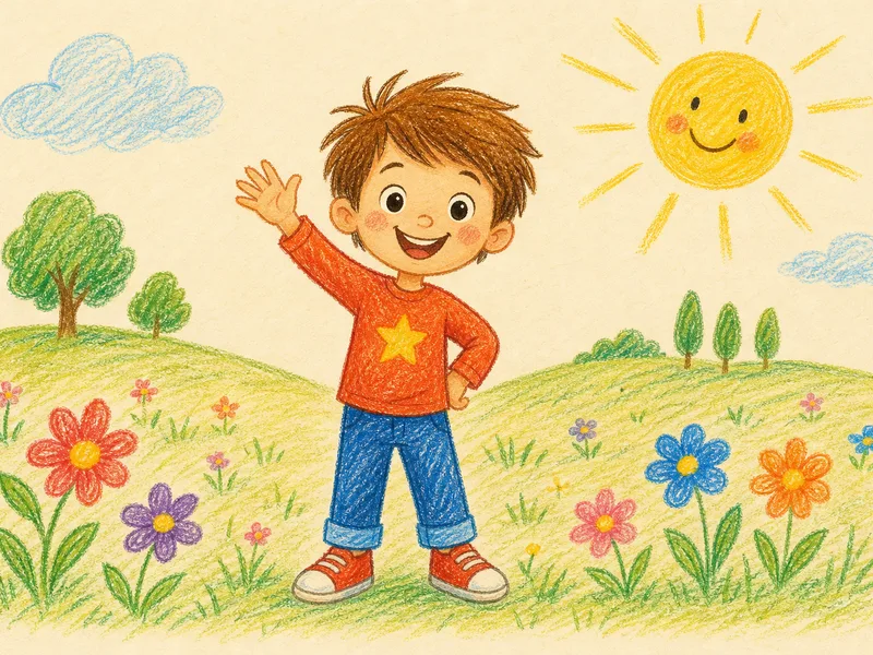
Waxy strokes on warm cream paper, sparse and joyful, like the best drawing your child ever brought home — done by a professional. Charming for younger children, and quietly funny in books about everyday life: lost teeth, puddles, first days.
The psychology: this is the one style built to intentionally echo a child's own hand rather than a professional illustrator's. The classic staged model of children's drawing development names the early years — roughly ages two through seven — as a period of scribbling and simplified, symbolic figures, well before a child draws with adult-style realism (Lowenfeld & Brittain, again described in the 2025 developmental review). Crayon Doodle deliberately keeps that sparse, uneven, joyfully imperfect quality rather than polishing it away — which is exactly why a child looks at it and recognizes their own visual language, not an adult's version of it.
Best for: the youngest readers, small everyday moments — lost teeth, puddles, a first day — and a book that shouldn't feel too grown-up. Look for the waxy, slightly uneven line weight and the cream paper grain underneath it.
Soft Felt#
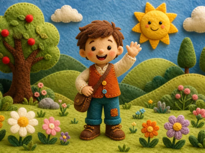
A hand-sewn felt diorama: fuzzy wool characters, blanket-stitch edges, button details, toy-theater lighting. The most huggable style of the nine. Toddlers adore it, and it makes bedtime books feel like a favorite stuffed animal in book form.
The psychology: "huggable" is a precise word for this one. Pediatric psychoanalyst D.W. Winnicott's foundational concept of the transitional object — a soft, comforting item like a blanket or stuffed animal that a young child bonds with as a source of security — has shaped how developmental psychology understands early comfort objects ever since he introduced it (Winnicott, 1953). A style rendered to look exactly like felt, wool, and stitched fabric is borrowing the visual language of the objects that already do that job in a toddler's world — which is why parents of the youngest readers reach for it first.
Best for: the very youngest readers, a first birthday or baby-shower gift, and any bedtime book meant to feel like an extension of the nursery. Look for the visible blanket-stitch edges and the button eyes — the toy-theater set lighting behind the character is the other tell.
Which style, at a glance#
| Style | Mood | Story genre it suits | A good gift for |
|---|---|---|---|
| 3D Cartoon | Warm, cinematic | Birthdays, everyday adventure | Almost anyone — the safest first pick |
| Classic Storybook | Timeless, gentle | Milestones, family history | Grandparents, christenings |
| Watercolor | Dreamy, soft | Bedtime, quiet moments | A new baby |
| Anime | Bright, expressive | Big adventures, big feelings | Kids six and up |
| Claymation | Playful, tactile | Funny, physical stories | A child who loves stop-motion films |
| Comic Pop | Bold, energetic | Superheroes, dinosaurs, sports | A comic-book kid |
| Paper Collage | Crafty, cozy | Everyday life, family stories | Craft-loving families |
| Crayon Doodle | Sparse, joyful | Small everyday moments | The youngest readers |
| Soft Felt | Fuzzy, huggable | Bedtime, comfort stories | A first birthday or new baby |
Is a more realistic style better than a stylized one?#
It's a fair question, and the honest answer is no — not for a young child, and arguably the opposite.
None of KindFable's nine styles is photorealistic, and that's a deliberate choice grounded in the same research above rather than a technical limit. Two separate strands of developmental psychology point the same way. First, a young child's understanding that any two-dimensional image — photographic or painted — stands in for a real object develops gradually and is not automatic (DeLoache, 2004); a hyper-realistic image doesn't get a head start on that symbolic leap just because it looks more like a photograph. Second, the caricature-advantage research above cuts the other way from what intuition suggests: mildly exaggerated, stylized faces are recognized faster than strictly accurate ones, not slower (Rhodes, Brennan & Carey, 1987), because exaggeration highlights the very features a viewer's memory already uses to tell one face from another.
There's also a simpler, practical reason a warm illustrated style beats photorealism for a children's book specifically: a storybook page has to sit comfortably next to painted skies, talking animals, and floating castles. A photorealistic child dropped into a hand-painted watercolor world looks like a sticker pasted on top of it, not a character who belongs there. Every one of the nine styles above keeps your child's actual likeness — same face, same hair, same features — while rendering them in the same visual language as the rest of their story's world.
This is also why "almost photorealistic" is the one zone worth actively avoiding rather than aiming for. Robotics researcher Masahiro Mori named the discomfort near-but-not-quite-real faces produce the "uncanny valley" back in 1970, and the same effect shows up in animated film and game character design today: a face that is almost a real photograph but not quite tends to read as unsettling in a way a warmly stylized face never does. Every KindFable style sits comfortably on the friendly side of that valley by design — none of the nine chase photorealism, so none of them risk landing in it.
How is this different from an AI photo filter?#
It's a fair comparison to want answered, since photo-filter apps and personalized books can look superficially similar in a screenshot: both start with a photo and end with a stylized picture.
The difference is what happens to that stylized picture next. A photo filter transforms one image — the same photo you uploaded, recolored or re-textured, and that's the whole product. A personalized book has to solve a harder problem: paint your child, in a chosen style, doing dozens of different things — climbing, waving, sleeping, laughing — across an entire story, in poses and settings that never existed in your original photo at all, while keeping the same face recognizable throughout. That's the reason KindFable paints one master portrait first and re-references it on every page rather than re-filtering the same photograph over and over — a filter has nothing to re-reference beyond the original image, so it can't extend a face into a scene the photo never showed. The how a photo becomes a book walkthrough covers that whole chain in more depth.
A caveat on all of the above. Every citation in this article is a real, separately-published study of general child development — baby-face preference, caricature recognition, infant color vision, bedtime routines, haptic learning, children's own art stages, and transitional objects. None of them tested KindFable, a personalized book, or even a children's book illustration specifically. What they establish is that the underlying perceptual and developmental mechanisms each style leans on are real and measured — not that "Comic Pop makes children learn faster" or any claim that specific. Treat the psychology sections as the honest reasoning behind a design choice, not as a marketing shortcut dressed up as a clinical trial.
What age should shape your style pick#
Here's the honest, age-by-age version, built on the same self-recognition research from the intro.
Under about 18 months, a baby is not yet reliably recognizing any image — mirror or painted — as themselves; that milestone hasn't arrived (Amsterdam, 1972). What does land at this age is everything around the picture: your voice reading aloud, the rhythm of a familiar page, the ritual of the same book at the same time each night. At this age the art style matters more to the parent choosing it than to the child looking at it, so lean toward whichever look you find warmest to read aloud from night after night — Soft Felt and Watercolor are popular first choices for exactly that reason, since they're also the two styles built around calm and comfort rather than excitement.
From roughly 18 months to 3 years, self-recognition clicks in and "that's ME!" becomes a real, visible reaction — a toddler pointing at their own painted face on the page, sometimes on the very first read. This is the age where a clearly-drawn, warm, high-contrast face pays off most, which is part of why 3D Cartoon and Classic Storybook are common picks for this stage: the baby-schema warmth and simple, legible shapes both land, and a two-year-old doesn't need Anime's exaggeration or Comic Pop's punch to recognize themselves — plainer, warmer faces already do that job well at this age.
From about 3 to 7 years, children start to have real opinions about illustration style itself, not just about their own face on the page — this is when kids start asking for Anime, Comic Pop, or Claymation by name because they already know the visual language from television and movies, and this is also the age where letting the child pick the style (rather than a parent picking for them) tends to produce the book that actually gets re-read.
For the fuller neuroscience of what a child's own name and likeness actually do to their attention and memory — well past the choice of art style — see our deep dive on what brain science shows about personalized books.
How your child stays your child in all nine#
The obvious worry with nine styles is that somewhere between watercolor washes and clay fingerprints, the hero stops looking like your kid. Here is how KindFable prevents that, without the jargon.
From your photo, the engine first paints one definitive portrait of your child as a storybook character — the master. We never save your original photo; only that portrait is kept. Then every single page of the book is painted by looking back at that same master portrait. Page twelve doesn't copy page eleven; both copy the original. That's why the face on the last spread matches the face on the cover — small errors never get a chance to snowball, the way they do when each image is based on the one before it.
The style then does its work around that anchor: it changes the world, the light, the texture, and the rendering — while the hero underneath stays the same recognizable child. Watercolor softens the meadow, felt turns it into stitched stage scenery, comic ink gives it speed lines — but the face waving from the middle of it is consistently, checkably yours.
The same anchoring applies to everyone else in the book. If you add companions — a grandparent, a sibling, the dog, up to three of them — each one gets its own portrait from its own photo, and every page refers back to it the same way. So grandma on page three is grandma on page thirteen, in whichever style you chose. You can see the whole chain in action in our walkthrough of how a photo becomes a book, and in our guide to what a personalized picture book actually is if you're comparing the format to a regular storybook for the first time.
Two practical notes worth stating plainly. First, a book carries exactly one art style, cover to final page — you can't mix Watercolor spreads with Comic Pop ones, and every companion character shares the hero's style, not their own. Second, the anchoring runs the same way regardless of what you end up holding: the digital book, the softcover, and the hardcover are all printed or rendered from the identical page set, so the consistency you see in a preview is the consistency that ships. Every format is covered on the pricing page — and the price depends on the binding you choose, never on which of the nine styles you pick.
Here's one complete finished book, page by page, in Soft Felt, so you can judge the anchoring with your own eyes rather than take our word for it:
The actual book
Read it, and hear it
Everything below is the finished book — not a mock-up, not a selection of the good pages. The narration and the song are the ones the family received.
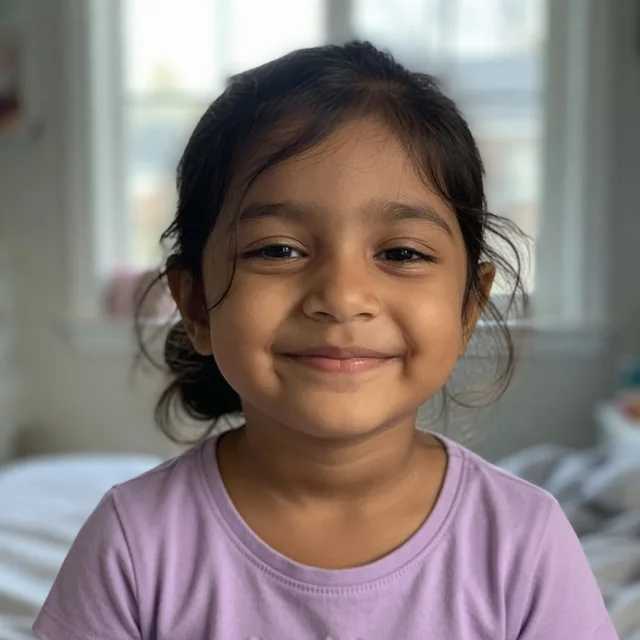
The photo they uploaded
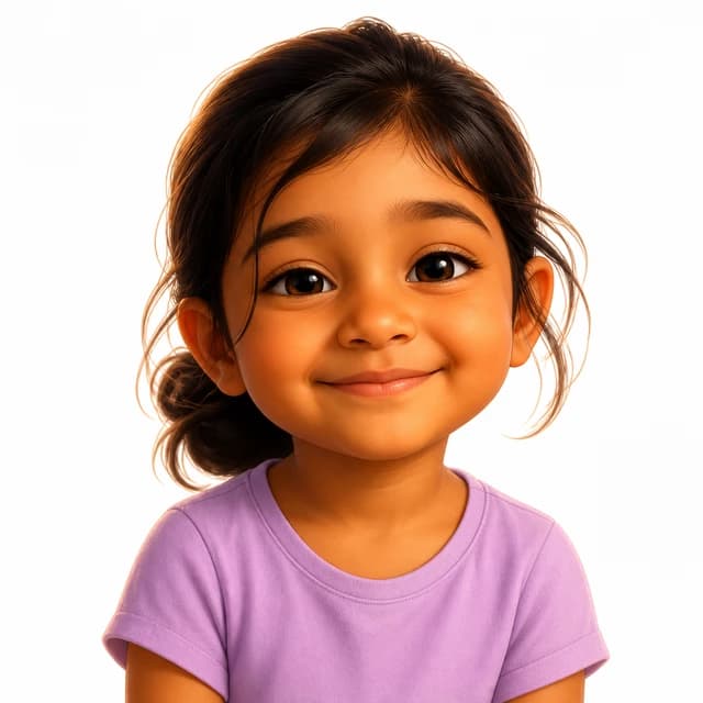
The character we drew
The whole book read aloud, the way it arrives with a hardcover.
Written from this story — not a stock track with a name dropped in. Free with every book.
The full story, in text
- 1Night folds over Noor's room. She opens the window and begins her star tucking.
- 2The youngest stars blinked first. Noor tucked them beneath soft clouds and said, "Goodnight, stars."
- 3The middle stars settled next. Noor smoothed their cloud blankets and sang, "Sleep tight, bright stars." The sky can rest.
- 4Then Favourite Star twinkled into place. Noor cupped her hands and called, "Rest now, Favourite Star."
- 5Only Moon remained awake. Noor asked, "What do you do after I fall asleep?"
- 6Moon smiled and lit the quiet paths between the clouds. "I keep watch," said Moon.
- 7Favourite Star bobbed beside Moon. "We keep the sky company together," it said. The sky can rest.
- 8Noor's breath slowed. She said, "Goodnight, Moon. Keep the quiet kindly."
- 9Favourite Star gave one last twinkle. Noor answered, "Goodnight, Favourite Star. Glow gently."
- 10Noor closed the window and brushed her teeth. Moon's glow slipped softly across the floor.
- 11Noor climbed beneath her quilt. "Goodnight, Moon," she said. Moon kept the window glow company.
- 12Noor slept safely. Moon, Favourite Star, and every tucked star kept the sky company. The sky can rest.
The words to the song
[Verse 1]
Noor opens wide the window
Young stars blink in the night
She tucks them under soft clouds
“Goodnight, stars,” says Noor

[Chorus]
Sleep tight, bright stars, sleep tight
Moon keeps watch with gentle light
The sky can rest, the sky can rest
Noor, close your eyes and rest

[Verse 2]
Middle stars find cloud beds
Favourite Star twinkles bright
“Rest now, Favourite Star”
Moon lights paths through clouds

[Chorus]
Moon and Favourite Star keep watch
They keep the sky company
Goodnight, Moon, glow so kind
Noor sleeps safe beneath her quilt
How to choose in one minute#
- Match the story, not the trend. A quiet bedtime story wants Watercolor, Classic Storybook, or Soft Felt. A rocket-powered adventure wants 3D Cartoon, Anime, or Comic Pop. Claymation, Paper Collage, and Crayon Doodle carry humor and everyday charm.
- Ask the child — if they're old enough to care. From about age five, kids have real opinions. Show them the pictures above and let them point.
- Think about the shelf. If this book is a keepsake for a christening, a new sibling, or grandparents, the classic styles age most gracefully.
- When in doubt, 3D Cartoon. It's the default for a reason: warm, modern, and flattering to every face.
- Giving it as a present? The style is part of the message. Watercolor or Classic Storybook reads as "keepsake"; Comic Pop or Claymation reads as "this is going to be so much fun." Our gift guide matches occasions to books in more detail, and our full price breakdown covers every format if budget is part of the decision.
Put simply: there is no wrong style, only a better or worse fit for this story, this child, and this shelf. The developmental research above explains why each of the nine works the way it does, but it was never meant to crown one winner — it exists so the choice feels like an informed one instead of a guess.
And remember the decision is genuinely low-stakes: start a book, pick a style, and you'll see the story and the cover in that style before paying anything. If you'd like to see full finished books first, browse the samples — then pick the world your child gets to be the hero of.
Sources#
The developmental research behind this article, for the diligent: Fantz, R.L. (1961), infant visual preference for pattern and complexity — overview: Nova Southeastern University summary; DeLoache, J.S., Trends in Cognitive Sciences 8(2), 2004 (PubMed); Amsterdam, B., Developmental Psychobiology 5(4), 1972 (PubMed); Glocker et al., Ethology 115(3), 2009 (PubMed); Fletcher, K.L. & Reese, E., Developmental Review 25(1), 2005 (abstract); Mindell, J.A. & Williamson, A.A., Sleep Medicine Reviews 40, 2018 (PubMed); Rhodes, G., Brennan, S. & Carey, S., Cognitive Psychology 19, 1987 (abstract); Bushnell, E.W. & Boudreau, J.P., Child Development 64, 1993 (PubMed); Franklin, A., Bevis, L., Ling, Y. & Hurlbert, A., Developmental Science 13(2), 2010 (PubMed); Lowenfeld, V. & Brittain, W.L., stages of children's artistic development, as reviewed in Education Sciences 15(6), 2025 (open access); Winnicott, D.W., International Journal of Psychoanalysis 34, 1953 (overview).